
Brand · Creative Direction
Catalyst
Health
From telehealth startup to healthcare infrastructure platform, carried by the brand.
- Role
- Creative Direction + Brand Strategy
- Scope
- Brand strategy, visual identity, logo system, guidelines
- Team
- Built in house

delivered
overhead
buyer focus
social, web
01
The problem.
The previous identity felt safe, but it lacked enterprise confidence.
Catalyst Health was no longer a telehealth startup. The business had moved into healthcare infrastructure, selling into complex systems with procurement committees and integration requirements. The brand had not moved with it.
The old system spoke in vague accessibility claims. The buyers it now needed to reach were evaluating whether this platform could integrate into an environment they could not afford to break.
02
Building
the identity.
First the problem. Then the strategy. Then the system that holds it all together.
Every mark intentional. Every weight considered. Every application built to scale across digital, print, and everywhere else the brand needs to live.
The mark
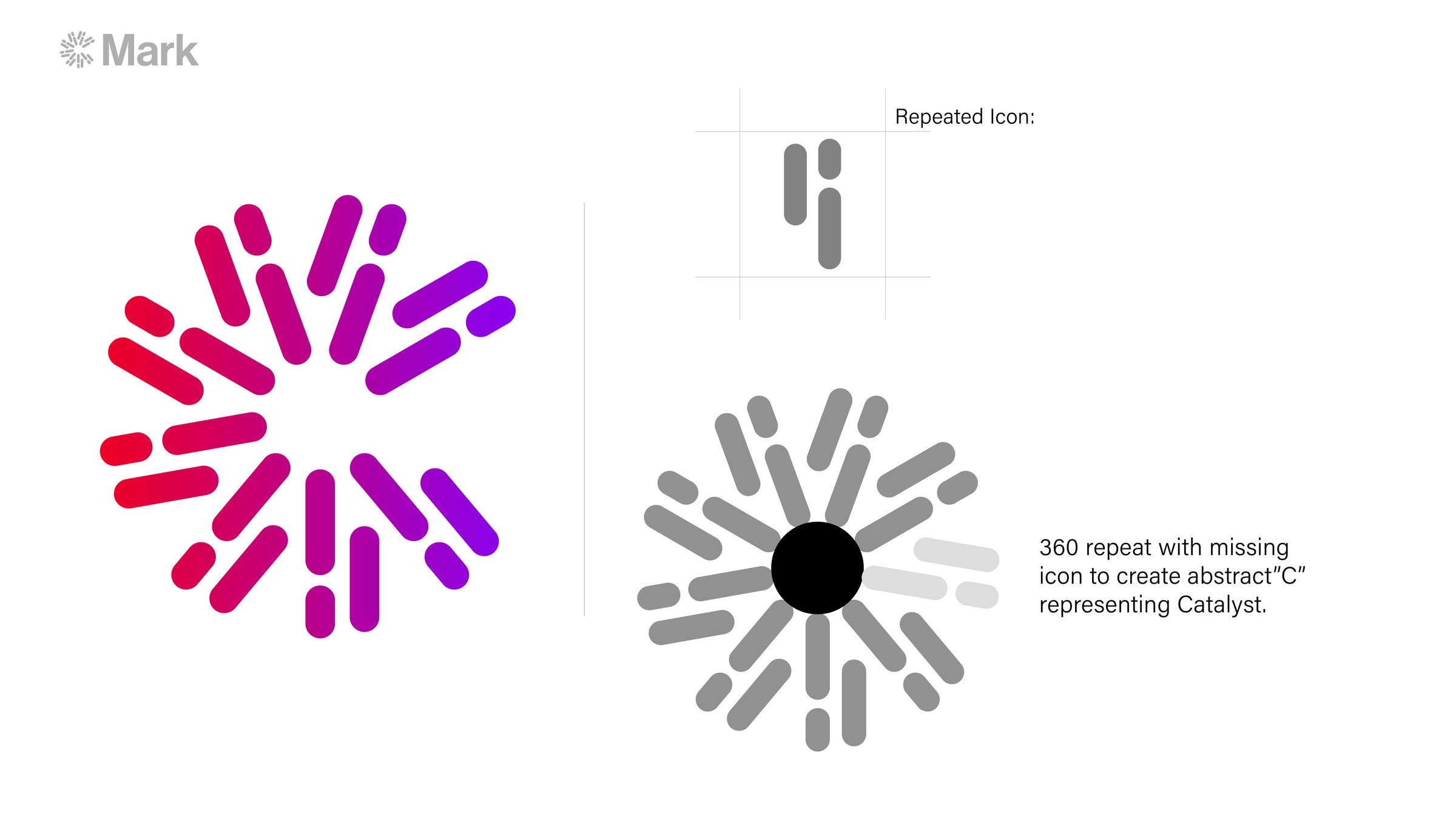
A two-stroke icon repeated through a full 360 rotation, with one instance removed so the negative space reads as an abstract C. Systematic rather than illustrative, and it survives favicon scale.
Typography
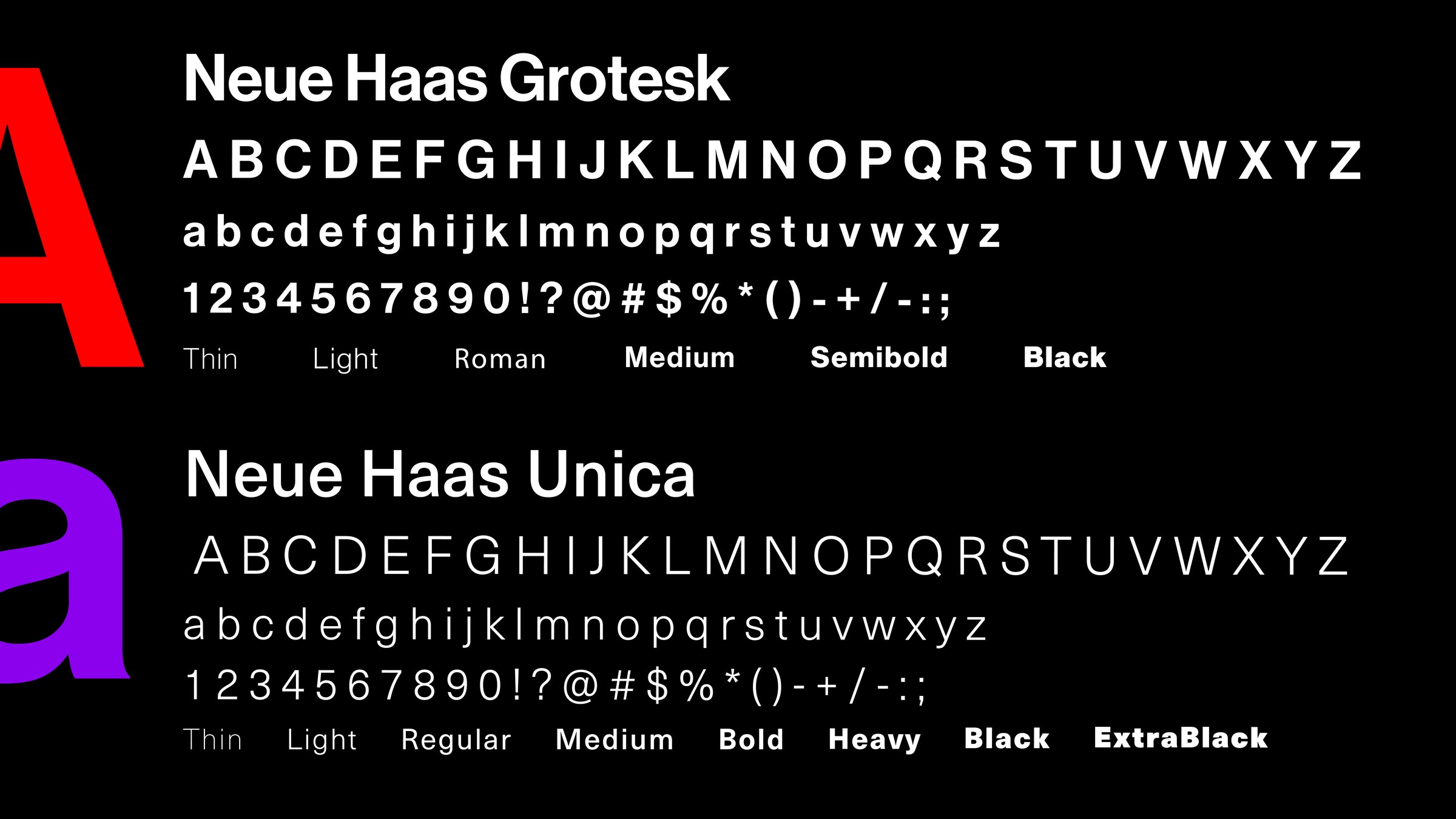
Neue Haas Grotesk for display and Neue Haas Unica for text. Swiss, neutral, and chosen to signal precision rather than warmth.
Color
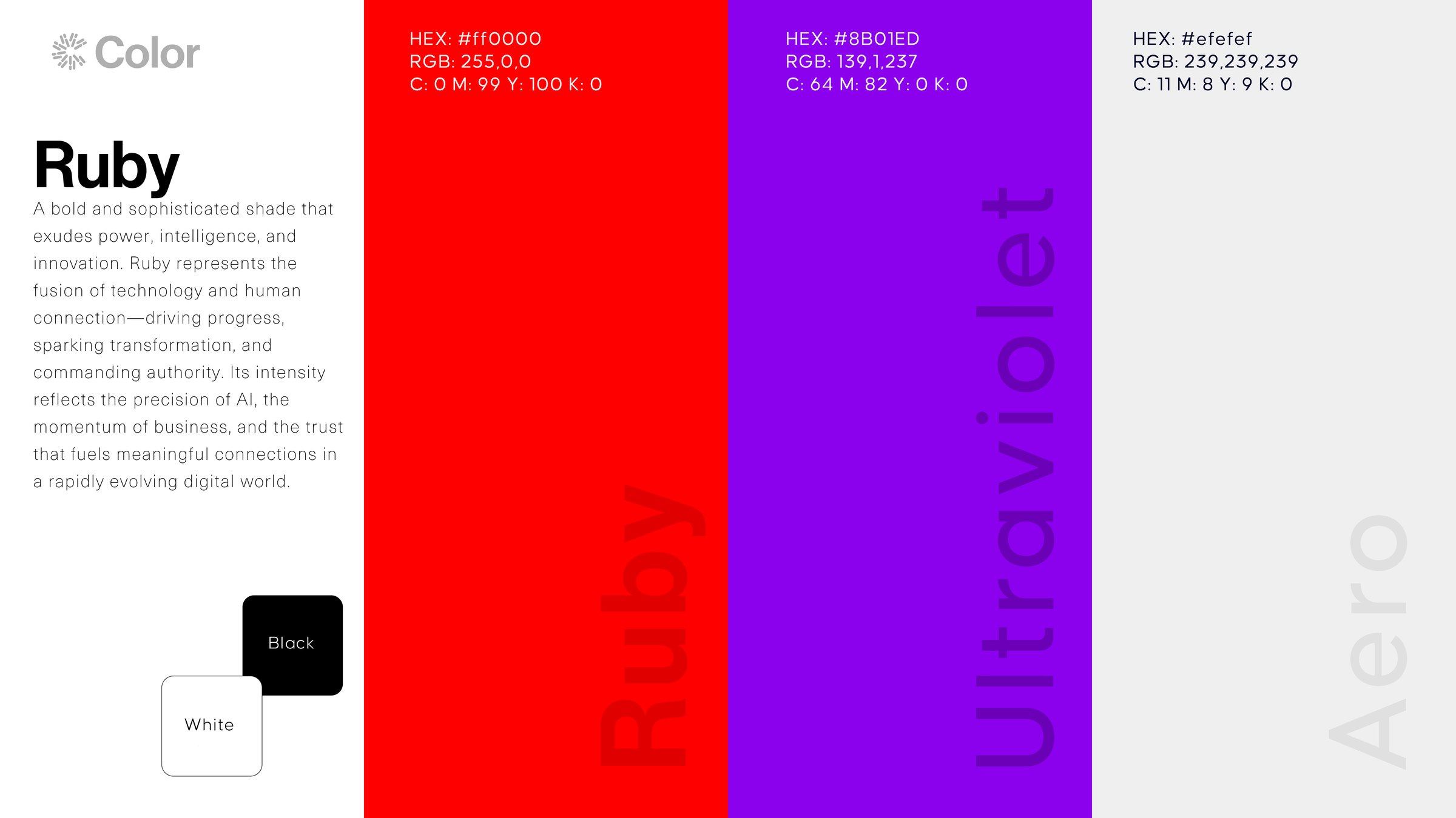
Ruby and Ultraviolet carry the gradient, Aero and black hold the structure. The palette does the work photography usually has to.
Modular framework
A structured layout system that holds across formats without needing an art director in the room every time.
Messaging
Repositioned around speed and integration, the two things B2B healthcare buyers actually evaluate.
Guidelines
Documentation so the system survives contact with people who were not in the original conversations.
The system
In application

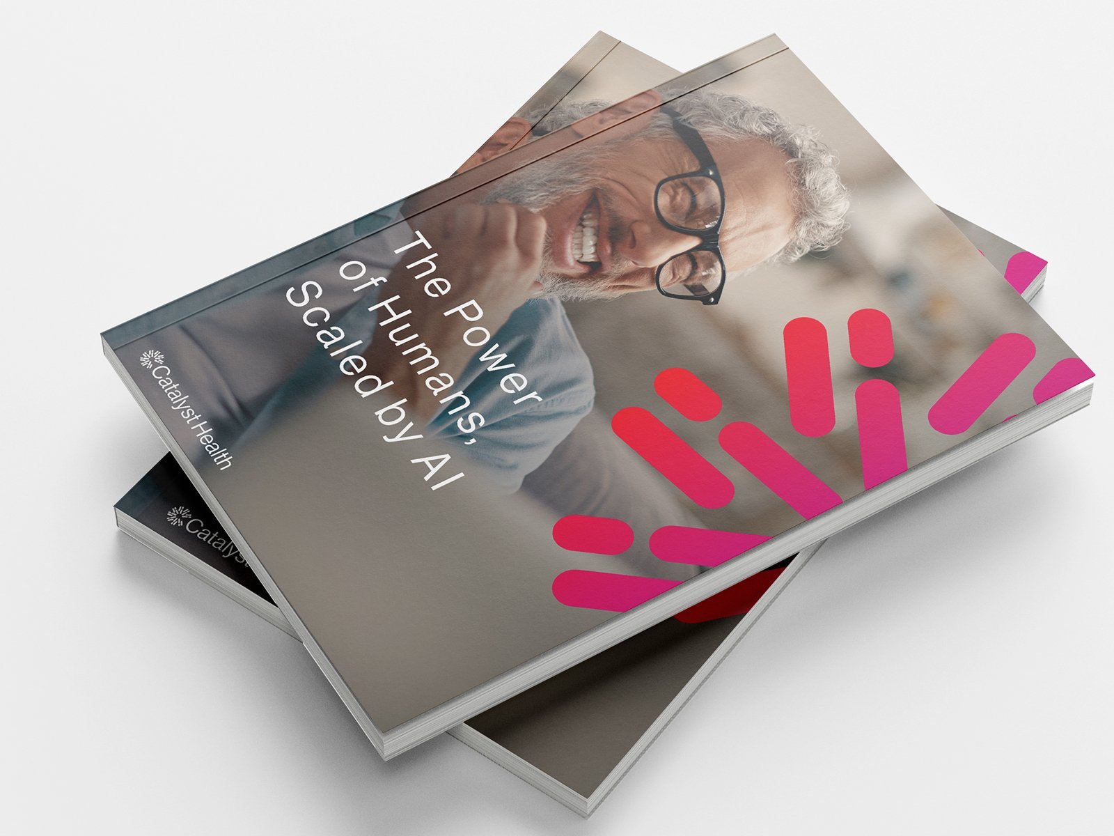
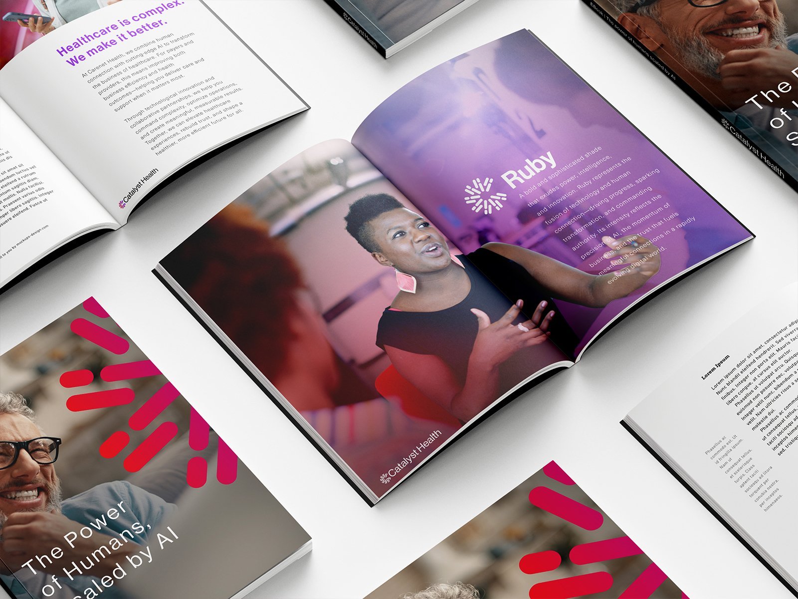
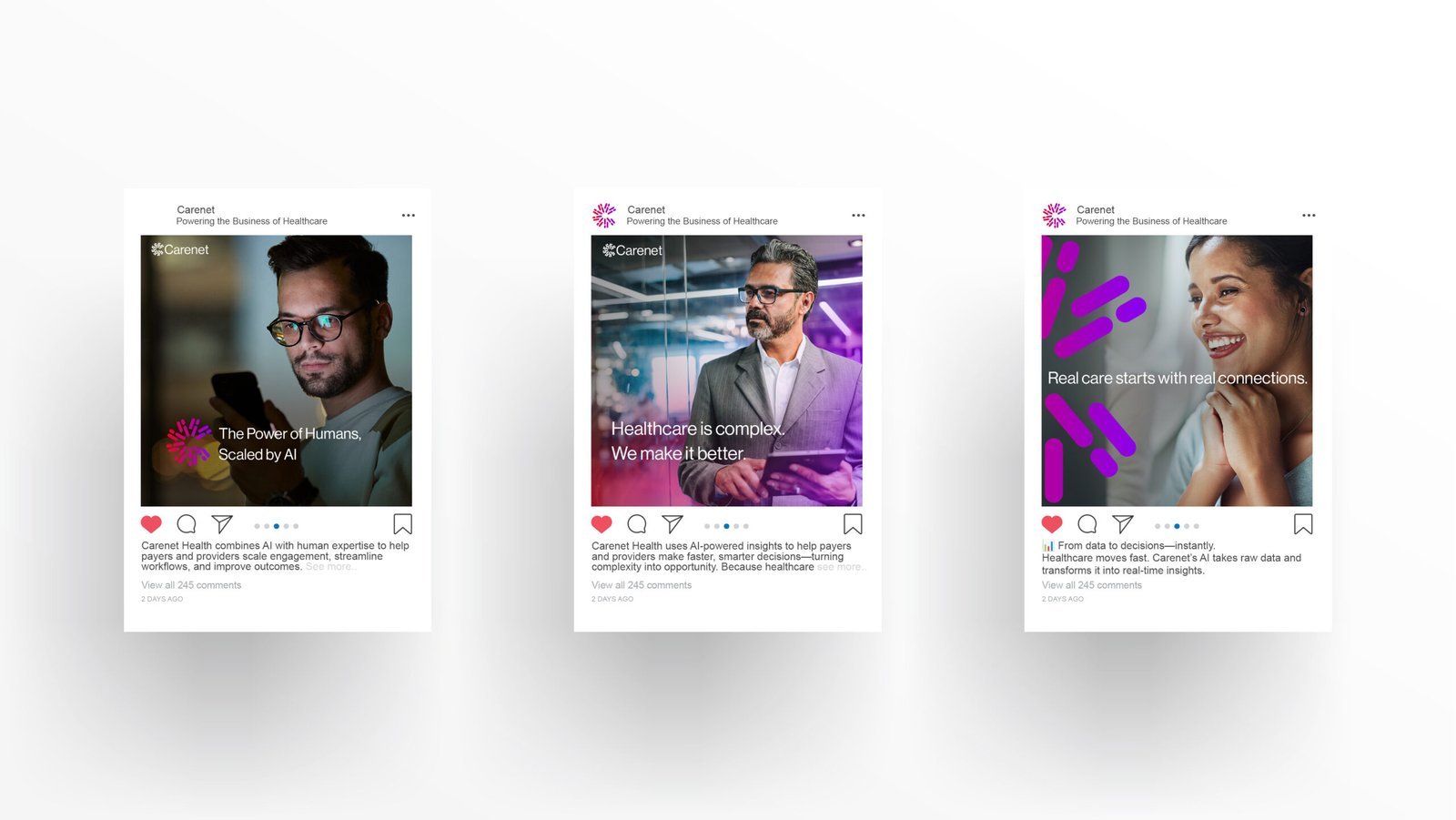

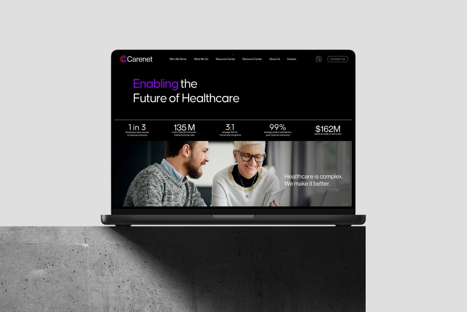
Every mark intentional. Every weight considered. Every application built to scale.
03
The result.
A complete visual system built in house, positioning the company as a tech-led operator rather than a healthcare commodity.
Swiss-inspired typography, structured layouts, and a design language that signals precision and authority. Every touchpoint, from logo to website to collateral, built to carry the repositioning.
The brand now carries the weight the business needs, without agency overhead and without endless revision cycles.
Next project