
Brand · Creative Direction
Carenet Health
Rebrand
Rebuilt to match where the business is headed, not where it started.
- Role
- Creative Direction + Brand Strategy
- Scope
- Brand strategy, visual identity, logo system, guidelines
- Team
- Built in house
01
The problem.
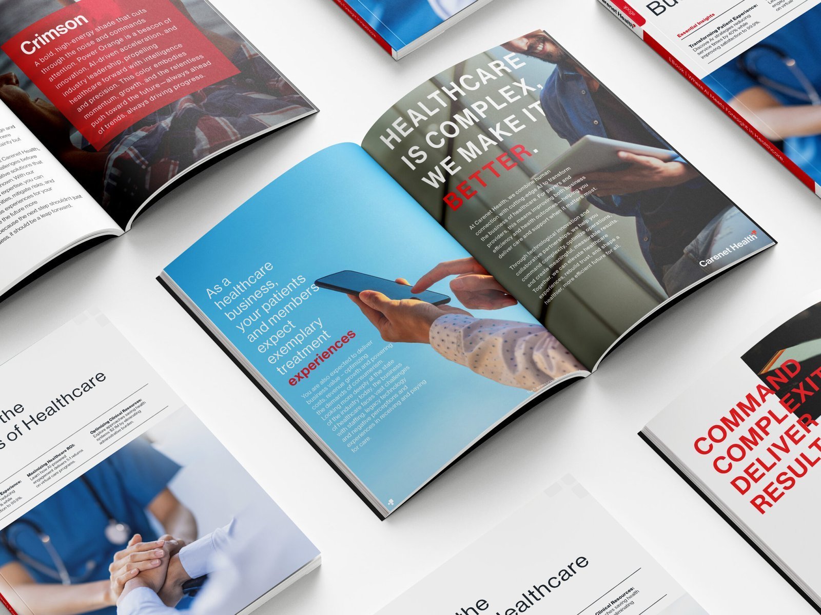
A healthcare services company that had become a technology operator, still wearing the brand of a vendor.
The business had moved. The identity had not. What existed read as a healthcare commodity in a category where the buyers were evaluating platforms, integrations, and operational sophistication.
A sharper, tech-led identity with clearer positioning and a more confident visual system, built to resonate with modern B2B buyers.




Every mark intentional. Every weight considered. Every application built to scale.
02
Building
the identity.
First the problem. Then the strategy. Then the system that holds it all together.
Typography
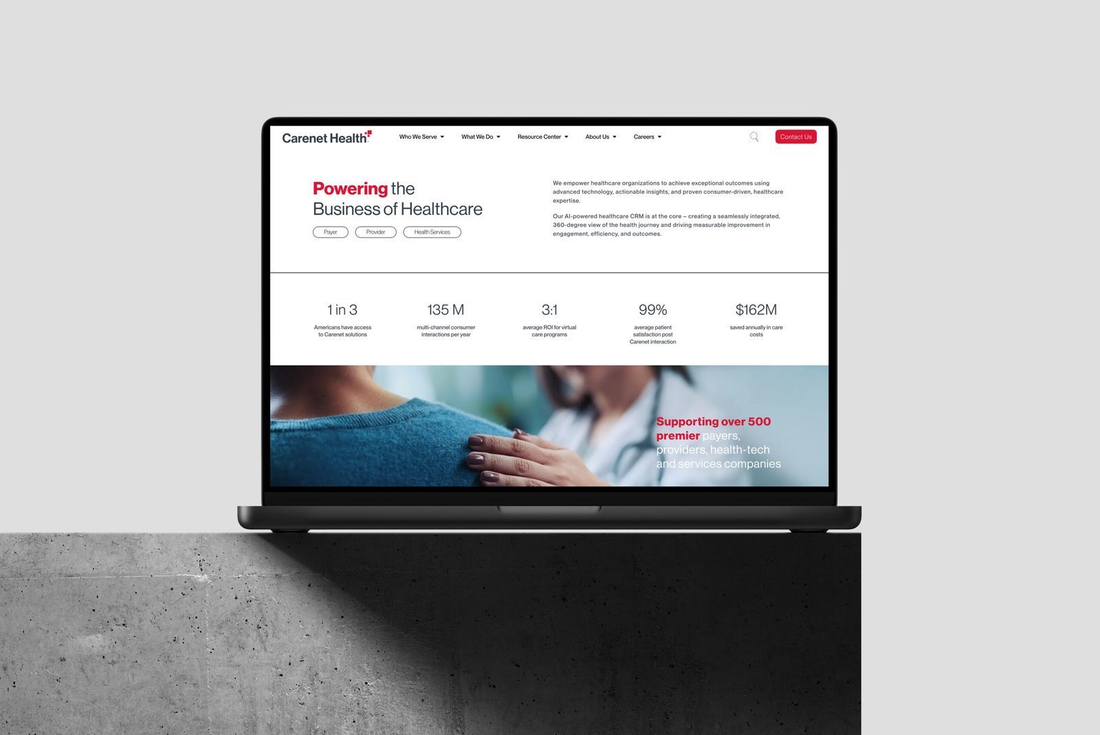
Swiss-inspired type selection with a strict hierarchy, chosen to signal precision rather than warmth.
Structured layout
A modular grid that holds across digital, print, and environmental applications without supervision.
Logo system
A mark and lockup set built to survive favicon scale and trade show scale equally.
Brand guidelines
Documentation so the system survives contact with people who were not in the original conversations.
03
The result.
A complete visual system built in house, positioning Carenet as a tech-led operator rather than a healthcare commodity.
Swiss-inspired typography, structured layouts, and a design language that signals precision and authority. Every touchpoint, from logo to website to collateral, carries the repositioning.
The brand now carries the weight the business needs, without agency overhead and without endless revision cycles.
Next project