
Publication Design · Editorial Layout · Art Direction
The Healthcare Costs
Declaration
A nine-page brand declaration and the one-page infographic built alongside it, the same argument told twice: once as an editorial essay, once as pure data.
- Role
- Publication Design & Art Direction
- Content
- Client-approved draft, directed & edited
- Client
- Carenet Health
- Format
- 9-page declaration + companion infographic

01
The project.
A publication design project for Carenet Health, one argument told in two formats: a nine-page editorial declaration for a reader willing to sit with an idea, and a one-page infographic for a reader who wants the numbers in thirty seconds.
The content came in as an approved draft for both pieces. My job was the art direction: making two documents with very different reading speeds feel like they came from the same hand.



02
The art
direction.
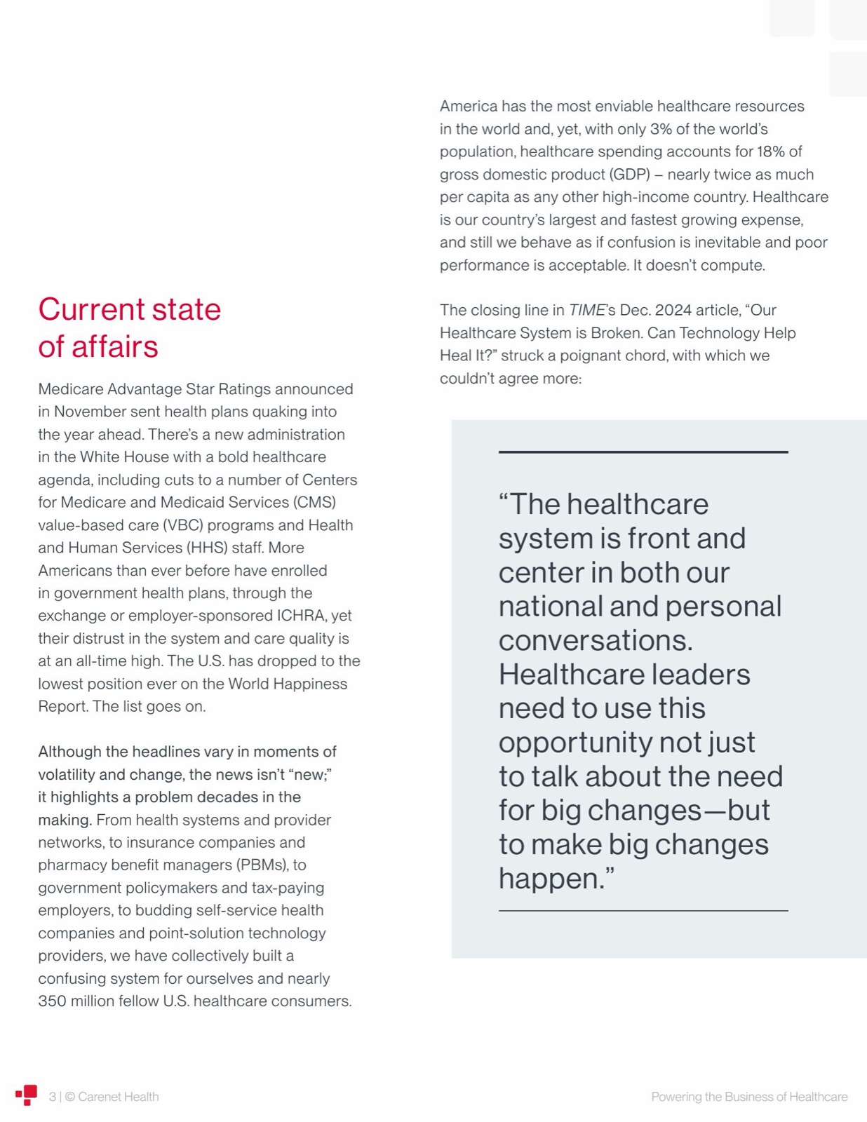
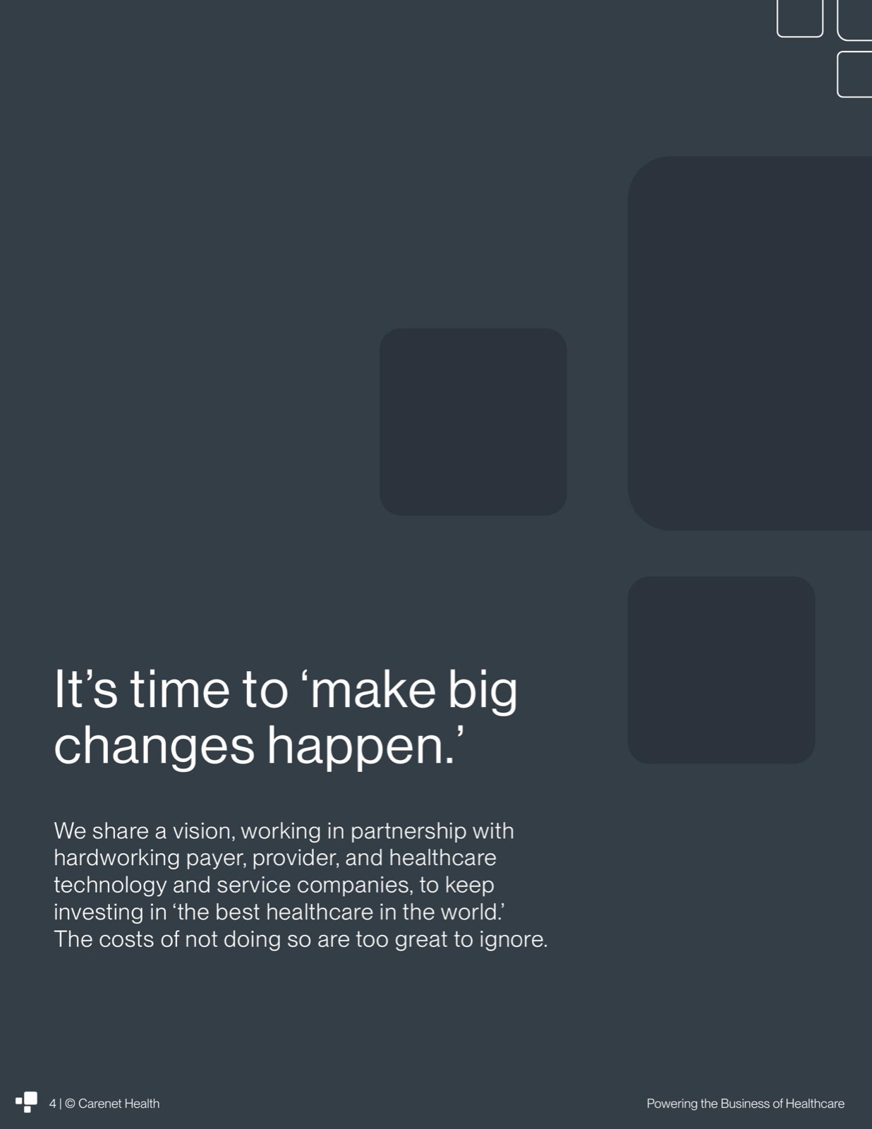
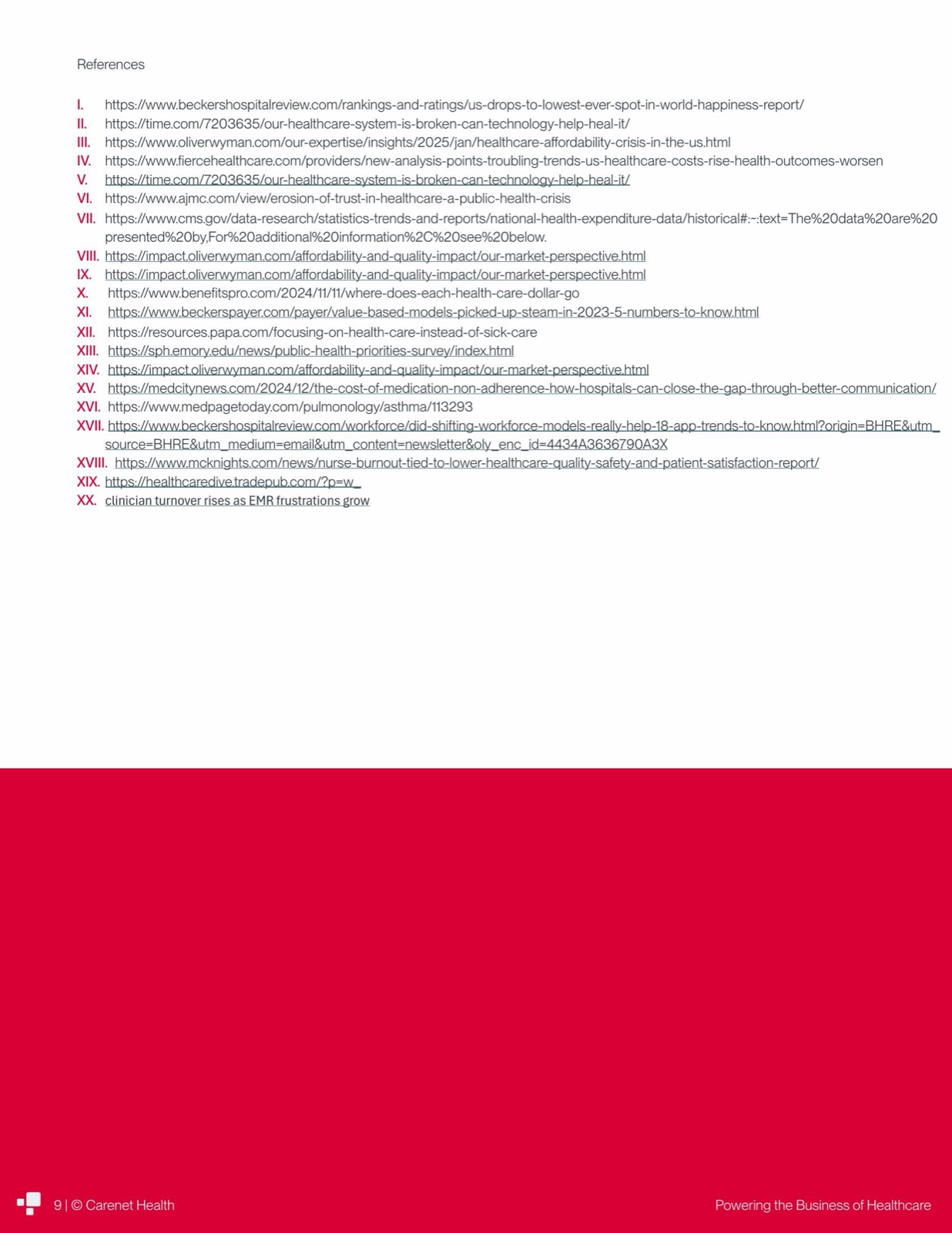
The declaration reads like an editorial essay, not a sales sheet, so it borrows editorial devices: a full-bleed pull quote lifted straight from a TIME magazine piece, set in serif-weight italics against white space instead of buried in a paragraph, and a single dark, color-blocked statement page, "It's time to make big changes happen," dropped in mid-document as a rhythm break, the same device the longer playbooks in this line use, scaled down to one page instead of several.
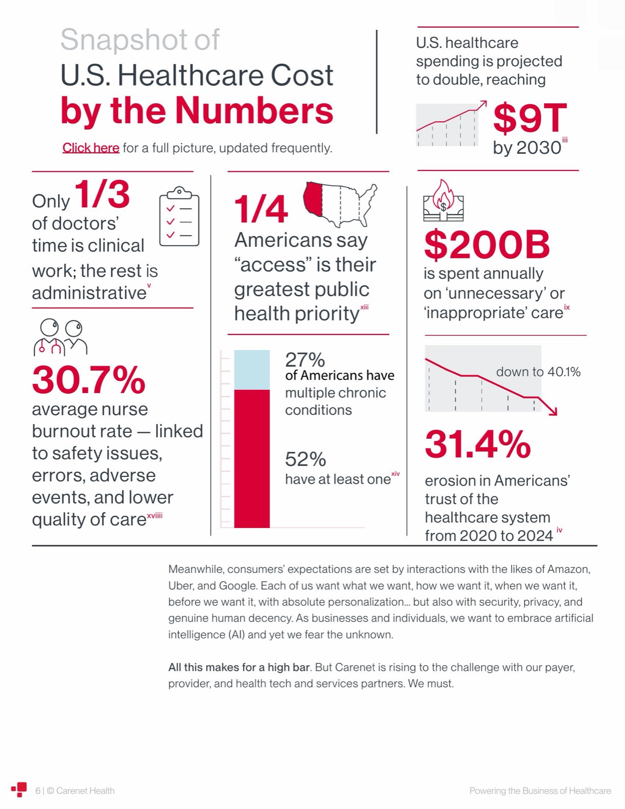
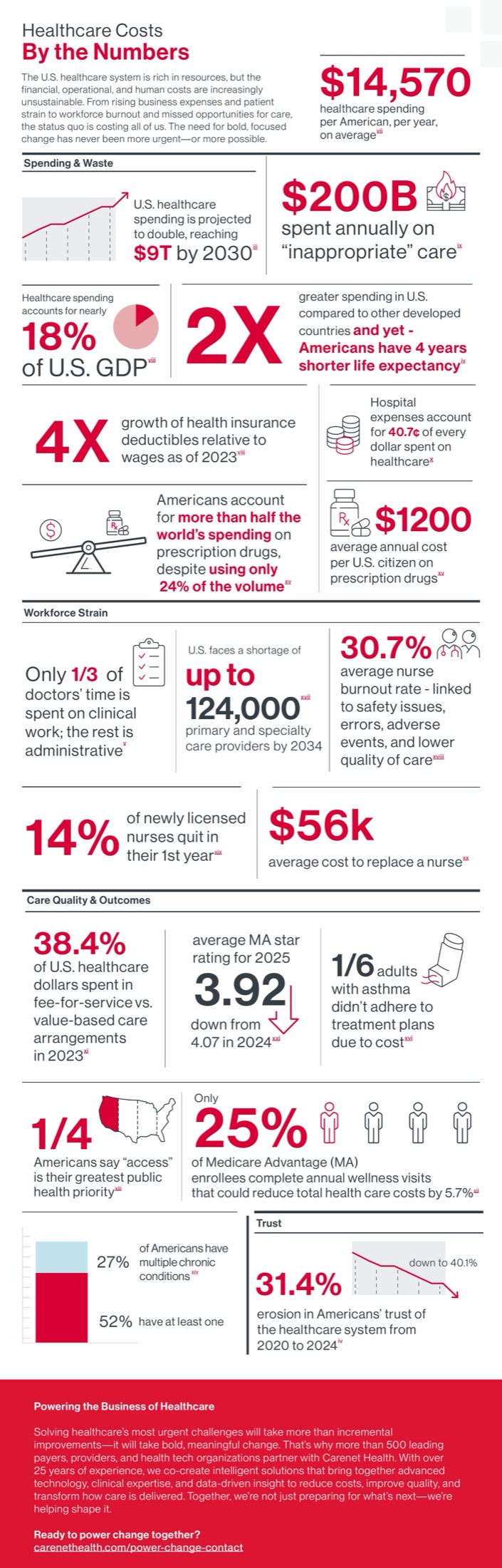
The infographic is a different problem entirely: roughly twenty disconnected statistics that all needed to read as one argument in a single continuous scroll. The fix was matching chart type to data type on purpose, a line for a number that grows over time, a donut for a share of a whole, a bar with a falling arrow for a metric in decline, and a plain icon-and-number card for anything that's just a fact, not a trend. Four category labels, each set off by a hairline rule, keep twenty numbers from reading as one undifferentiated wall.
Every headline number in both pieces, whether it sits inside a chart or a paragraph, runs in the same red. The declaration even has its own stat-snapshot spread, the same icon-and-number treatment as the infographic, dropped in mid-document, a preview of the standalone piece before the reader gets there. That consistency is what makes the two pieces read as one project instead of two unrelated documents that happen to share a logo.

03
The full
declaration.

04
The companion
infographic.
Next project